BlocksCategory Cards
Blocks
Category Cards
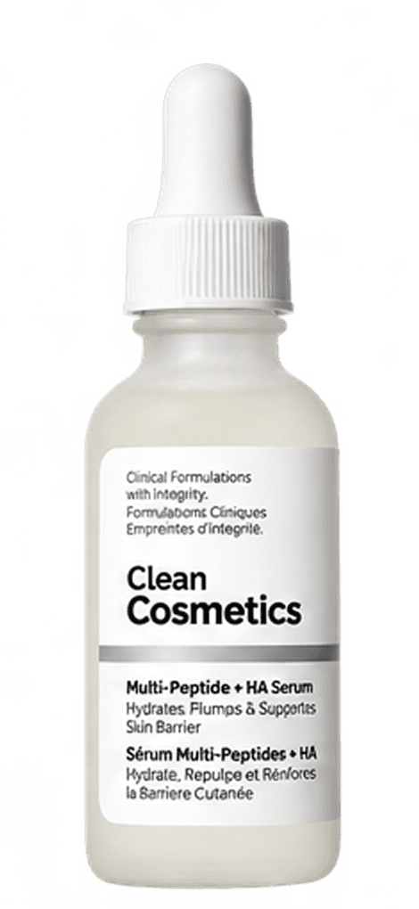
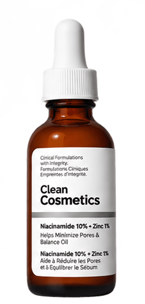
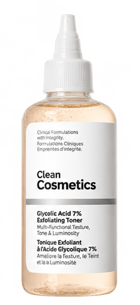
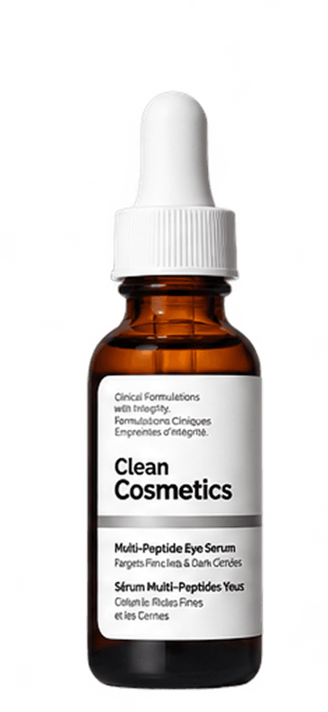
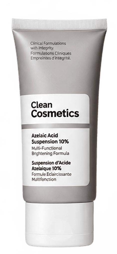
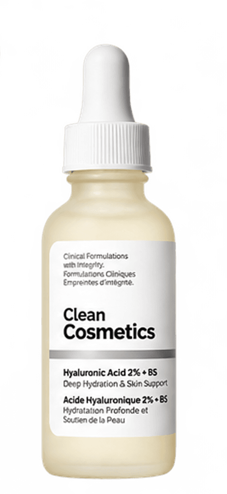
'Common Concerns' row extracted from the homepage. The live site uses real model photography here; product photos stand in as local dev placeholders — not a real thematic match for skin-concern imagery.
Configurator
Usage
<CategoryCards
  title="Common Concerns"
  description="Not sure where to begin? Here are some common skin concerns."
  items={[
    { label: "Aging", image: "/products/multi-peptide-ha-serum.png" },
    { label: "Congestion", image: "/products/niacinamide-10-zinc-1.png" },
    { label: "Texture", image: "/products/glycolic-acid-7-exfoliating-toner.png" },
    { label: "Eye Care", image: "/products/multi-peptide-eye-serum.png" },
    { label: "Redness", image: "/products/azelaic-acid-suspension-10.png" },
    { label: "Dryness", image: "/products/hyaluronic-acid-2-b5-with-ceramides.png" },
  ]}
/>
Props
| Prop | Type | Default | Description |
|---|---|---|---|
| title | string | "Common Concerns" | Section heading. |
| description | string | — | Short line under the heading. |
| items | CategoryCardItem[] | — | { label, href?, image? } tiles; defaults to the six concerns sampled from the site. Falls back to a Camera placeholder icon when image is omitted. |
Do's and Don'ts
Do
- ·Keep item labels to one or two words — they sit under a small square tile with no room to wrap gracefully.
- ·Link each item to a real filtered collection once one exists, rather than leaving every href as "#".
- ·Swap in real, licensed concern photography before production — the product photos here are local dev placeholders only, and aren't a genuine thematic match.
Don't
- ·Don't use this component for anything that isn't a small, fixed set of entry points (6 is about the practical ceiling before tiles get too small).
- ·Don't leave mismatched placeholder images in a shipped build — an unset image (icon placeholder) reads as more honest than a product photo standing in for a skin concern.