BlocksProduct Card
Blocks
Product Card
Mirrors the PDP tile used across Clean Cosmetics grids and carousels. Hover the image to reveal Quick View.
Configurator
Bestseller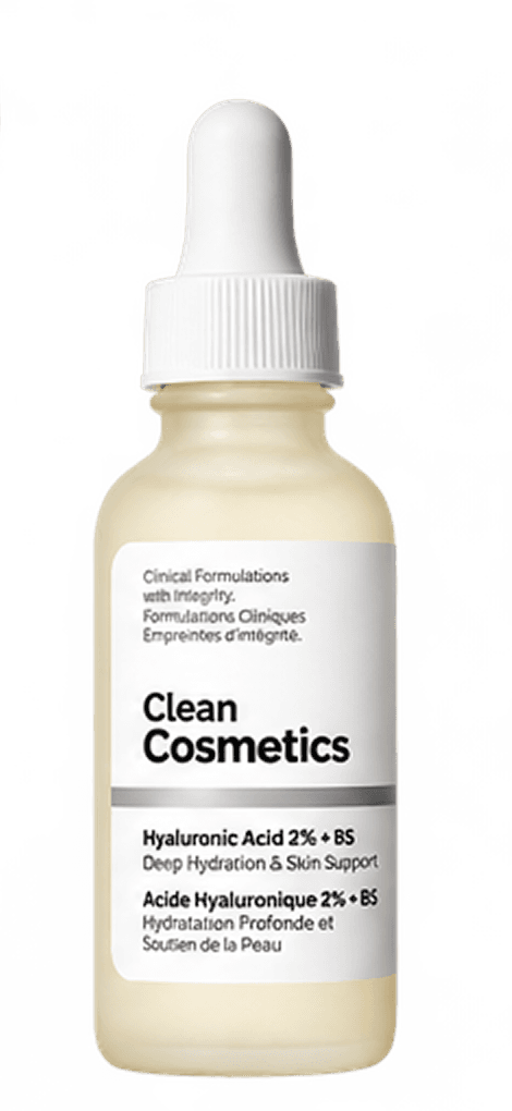
Hyaluronic Acid 2% + B5 (with Ceramides)
4.4(1,881)
Plumps, Smooths
$9.90 USD
Usage
<ProductCard
  eyebrowBadge="Bestseller"
  title="Hyaluronic Acid 2% + B5 (with Ceramides)"
  rating={4.4}
  reviewCount={1881}
  benefits="Plumps, Smooths"
  price="$9.90 USD"
  sizes={["30ml", "60ml"]}
  defaultSize="30ml"
  imageSrc="/products/hyaluronic-acid-2-b5-with-ceramides.png"
  quickView={{ /* ... */ }}
/>
Props
| Prop | Type | Default | Description |
|---|---|---|---|
| eyebrowBadge | string | — | Tag shown top-left of the image (e.g. "Bestseller"). |
| stampLabel | string | — | Circular Badge label overlapping the image's bottom edge. |
| title | string | — | Product name. |
| rating | number | — | 0–5 rating, passed to Rating. |
| reviewCount | number | — | Review count shown next to the rating. |
| benefits | string | — | Short benefit line under the title. |
| price | string | — | Formatted price string. |
| sizes | string[] | — | Size options rendered as selectable text. |
| defaultSize | string | — | Initially-selected size. |
| imageSrc | string | — | Product photo; falls back to a Pipette placeholder icon when omitted. |
| quickView | ProductCardQuickView | — | Presence of this prop is what enables the hover overlay and wires up the Quick View modal. |
Do's and Don'ts
Do
- ·Pass quickView whenever the product has enough detail to justify it — the hover affordance only appears when it's set.
- ·Keep benefits to a short phrase; the layout gives it one line before the price row.
- ·Render ProductCard inside a CSS grid with items-stretch so a row of cards lines up at the same height — the card already fills its container via h-full.
Don't
- ·Don't set both stampLabel and expect it to coexist with a tall eyebrowBadge without checking the layout at your target width — they share the same corner region.
- ·Don't omit sizes; the price/size row assumes at least one option is present.